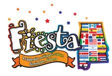
It’s like having a child and suddenly that child is close to adulthood and you don’t know where the time went! That’s the only way I can describe what I’m feeling now that Fiesta, Alabama’s largest festival of Hispanic culture is turning 15!!!
I’ve been a part of Fiesta since the very beginning. I’ve talked about this in previous posts and this year has really been a trip down memory lane with all the plans for the festival’s quinceañera. A “quince” is a young girls’ coming of age event in Hispanic culture, much like a Sweet 16 for an American girl. So as plans were being made by the board of directors for our milestone celebration, it was decided we would refresh our logo. We did this at our 5 year and again for our 10 year anniversary so we decided fifteen was the perfect opportunity to do it again.

Fiesta’s first logo in 2003
Our first logo was done rather quickly. I would have to look back into my archives to remember who created it for us but I do remember that we wanted the Birmingham skyline to appear in the background. The graphic artist decided to put the skyline in sun design against a blue – almost turquoise background. The Fiesta word was outlined in red which really made it stand out. We were so happy with the logo. I mean, we were young (in festival years), and pretty inexperienced in running a festival so we were just so happy to have something to represent our event!
Fiesa’s logo at year five with the added feature of the flags of all the Hispanic countries woven into it – the US flag is in the center!
At year five, we wanted something new. We worked with a recommended graphic artist to create something that would include all Latino countries. The result, was a two layered logo – the Fiesta name with each letter in white and outlined in different colors and an additional feature of the state of Alabama with the flags of all the Hispanic countries knit together like a cultural quilt. I always loved the flag feature of this logo…so inclusive and colorful!
Fast forward to our ten-year anniversary…this time we had definite thoughts and opinions about what the logo should represent. I remember meeting with the graphic artist and a few of the board members one night at Rogue Tavern. We talked about the logo and making sure that it represented as many areas of Hispanic culture as possible. The tendency with anything Hispanic is to use papel picado, Mexican hats, maracas and piñatas! These items all represent Mexico and our festival has always worked hard to dispel the idea that everyone who speaks Spanish is Mexican, so… It was imperative to make sure that other subtle aspects of Hispanic culture from around the world were featured.
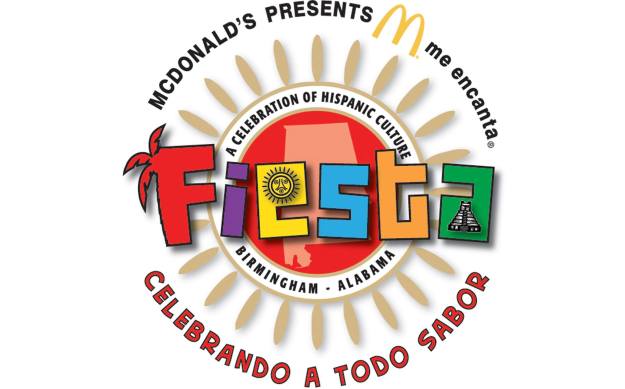
Year 10 logo with our “theme” for the year – Celebrando A Todo Sabor – celebrating the flavor of Fiesta. It also includes the logo around the top of our Title Sponsor – McDonalds.
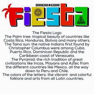
Board Member, Lui Fernandez, himself a graphic artist, worked closely with Sam George, recommended by Denise Koch, Fiesta’s Event Manager, to create the 10th anniversary logo. When it was unveiled, I remember thinking that the look just kept getting better and better. Lui went over the symbols represented in the logo at the unveiling and people present spoke about how meaningful it was to hear the kind of work that went into creating the logo. After the reveal though, I don’t know that we did a good job of explaining the new logo and symbolism to the community at large. I took it for granted that everyone knew. I couldn’t have been further from the truth. In fact, just last year Lui and I were at an event at the Birmingham Museum of Art with several Latino friends when he began talking about the symbolism and they said they had no idea about it all! It was a clue to us to make sure we got the word out before Fiesta about what the logo meant. Lui created an English-Spanish graphic to explain it that we shared on social media.
-
-

And here we are at our Quince…Fiesta hired Style Advertising to work with us to create a new logo this time. Lui and Fiesta board member, Cristina Almanza, both worked with Grant Tatum of Style Advertising to talk through what the logo should be. We wanted to be sure that the logo was an evolution of what we have had for the past 14 years. We’ve had 3 logos to date and this one should be a mature, grown up look for Fiesta. At the presentation to the board, where we were shown three options, it was unanimous as to which logo we wanted. It was an exciting and satisfying night!

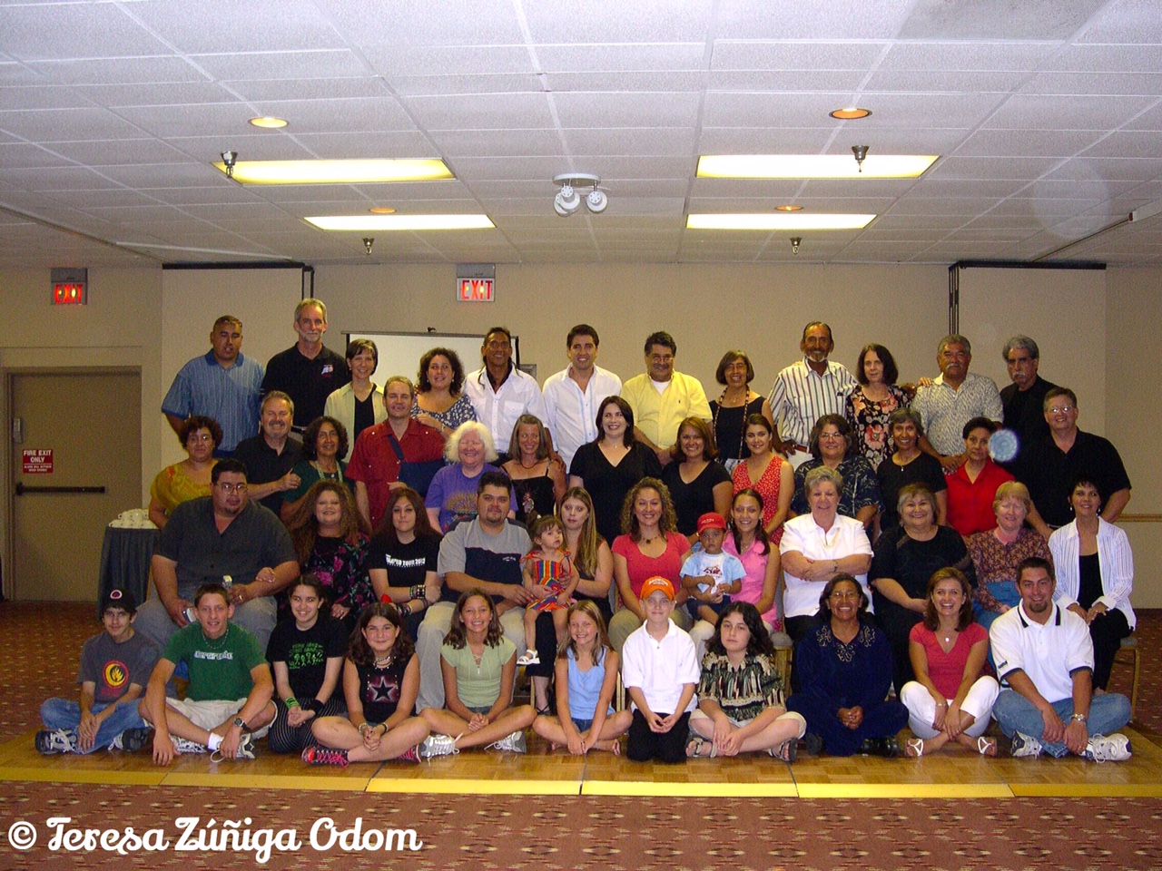
The Fiesta board of directors gathers for a photo before the new logo unveiling – back row – Lui Fernandez, Orlando Rosa, Matt Ennis, Floresha Boyd, Ashlee Jones, Chris Miller and Carlos Aleman. Seated – Cristina Almanza, Teresa Zuniga Odom and Vanessa Vargas
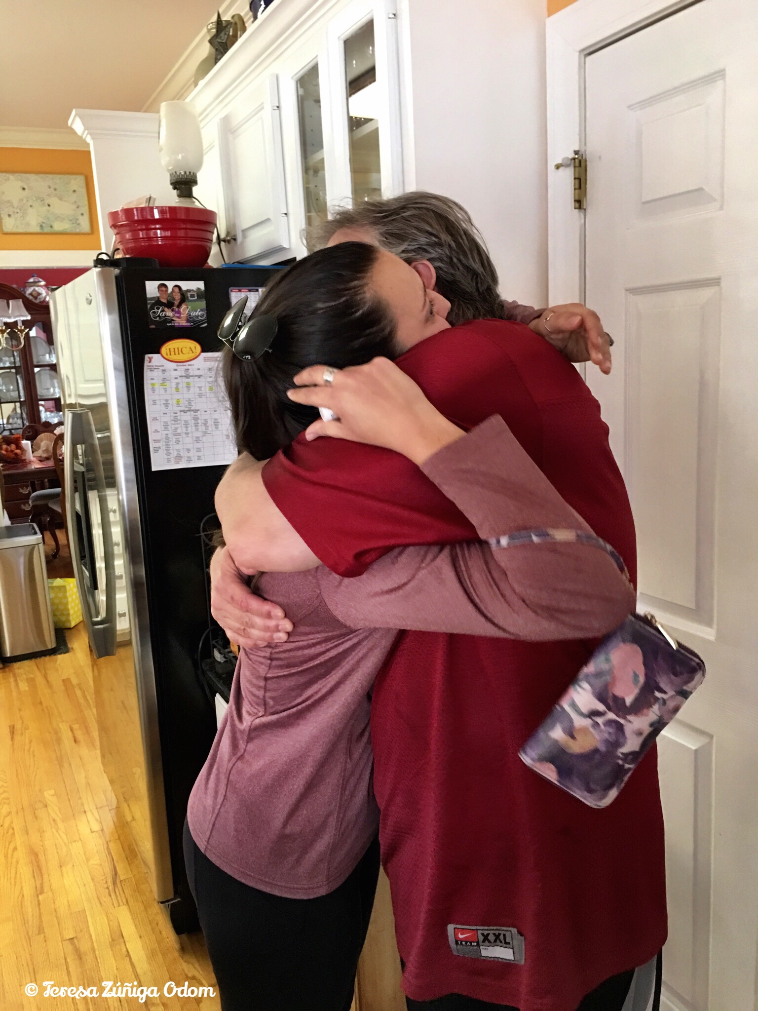
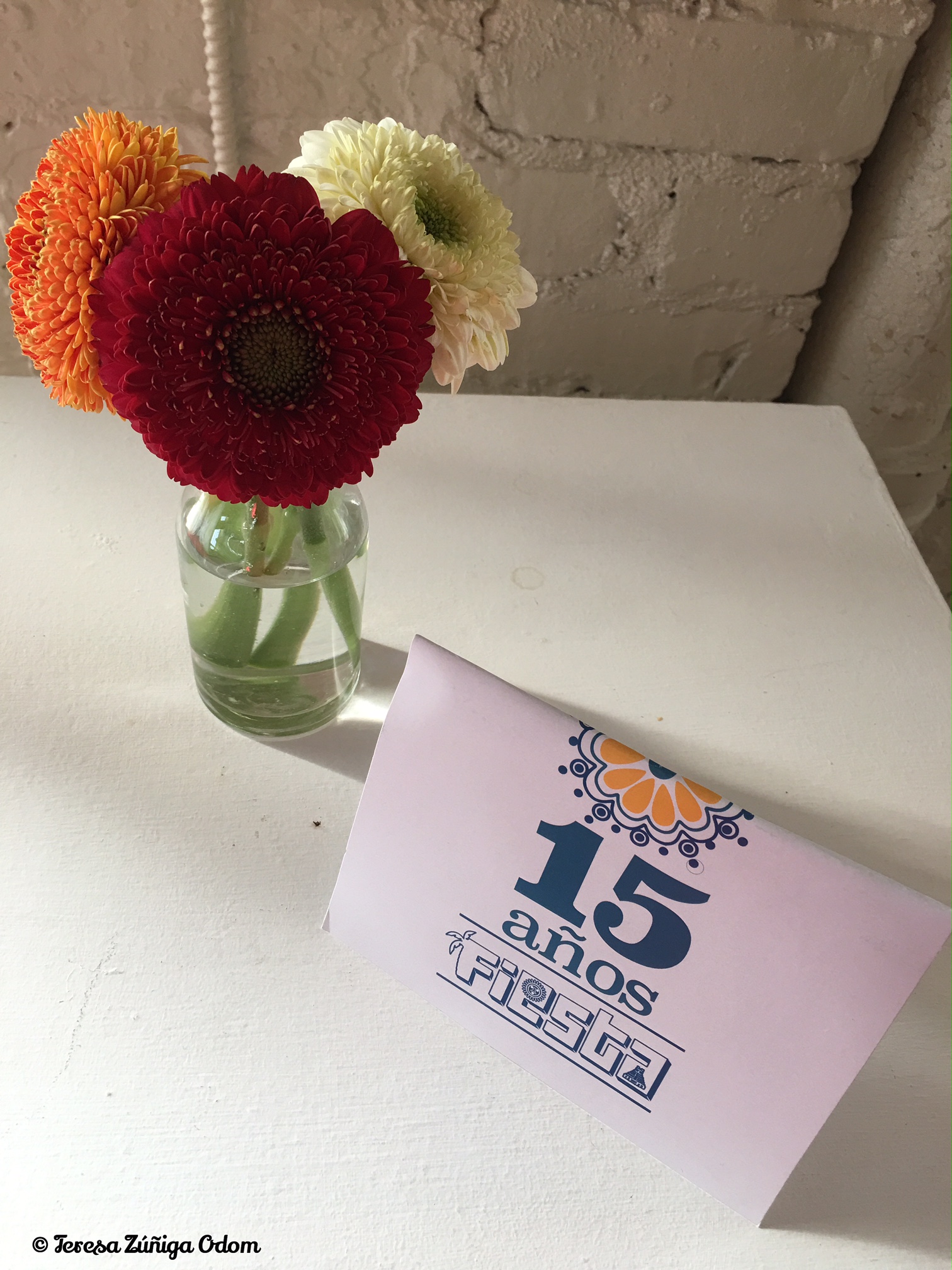
So, last Thursday, April 27, we gathered sponsors, family and friends who were with Fiesta since the very beginning, and revealed the new Fiesta logo. Lui went into detail about what the logo represents and Grant ran a slide show to coincide with Lui’s words. It was perfectly orchestrated and very emotional for me. As Lui finished up his presentation, he called me and my co-President, Vanessa Vargas forward to unveil the logo. Again…so many emotions were running through me during the short walk to the front of the audience to lift the cover of the logo. The first thought was how incredible it was that this festival has lasted and is celebrating 15 years! The second, as I looked at Vanessa walking up with me, was that this young woman was around 12-13 years old when we got Fiesta started and has been there each and every year in some way to support the event along with her parents, Lucero and Jairo Vargas, owners of Latino News. She is not at the helm of this festival and leading it! The third was that this was indeed a “celebration of generations” as together we (me symbolizing the mother and Vanessa symbolizing the daughter ) lifted the cover to reveal the logo to huge applause. It was also such a humbling moment…to have been a part of such a fabulous event celebrating Hispanic culture since the very beginning and to watch it evolve over the years has been such a blessing. My baby is growing up!!!
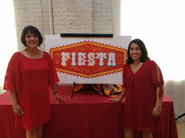
Me and Vanessa, right after the logo unveiling! We both decided to wear red to match the new logo!
Here are a few photos from the event, including the wonderful food provided by Jose Chavez of Taqueria Mexico in Birmingham, the wonderful venue at Bridgestreet Gallery and Loft with GoPro Events and florals and decorations by our Fiesta Event Manager – Denise Koch of Denise Koch Events. We also awarded $6500 in Fiesta Scholarships at the event and those pictures are features here. A future post will talk about this in more detail.
This slideshow requires JavaScript.
Transcript Lui Fenandez read about the logo reveal event:
Since its inception in 2003, the Fiesta festival has served as a bridge, celebrating the culturally diverse traditions of Latin America’s various Spanish-speaking countries. As Fiesta approaches its 15th year, we have started thinking of this year’s celebration as the festival’s Quinceañero. Just as a young girl’s quince represents her transition from childhood to adulthood – we feel this milestone year is, for our festival, a bridge to a new level of maturity.
It has become a tradition for our festival to introduce a new, refreshed logo every five years. As the logo evolves again for Fiesta’s quince, we wanted to take special care to help its identity continue to grow. Working with the creative team at STYLE Advertising, we’ve given careful consideration to the blending of the many pre-Columbian cultural traditions with those brought by the Spanish. As we approached this project, we poured over posters depicting 20th century air travel, bull fighting and wrestling, album covers for salsa, bosa nova and tango, as well as depictions of Taino, Aztec, Mayan and Incan art and architecture. Our vision was for each of these aspects to come together and communicate a Celebration of Generations, the theme for this year’s Fiesta.
Latin America’s rich and varied graphic and typographic heritage was also influential and inspirational in developing Fiesta’s new logo. The typeface we chose radiates a playful exuberance. It is a woodtype-styled, decorative face that has characteristics reminiscent of the cut-stone glyphs of the Incas, Mayans and Aztecs, while also remaining evocative of traditional, ornamental Spanish design.
In addition to our careful, typographic considerations, color proved another significant design element to incorporate. The predominant, rich red serves as a background that unifies the new mark. It is the red found in a matador’s cape, the dresses of tango and flamenco dancers and the traditional costumes of many indigenous peoples. The vibrant red is also a significant color for festivals like Carnival de Barranquilla, Oruro Bolivia, and Ponce Puerto Rico, uniting Fiesta with other Latin American festivals while still maintaining its own unique identity.
In order to give the Fiesta logotype depth and vibrancy in addition to its rich, red background, we also incorporated the lively, multi-colored palate used in previous versions of the Fiesta logo. These vivid colors are found in Mexican picados, traditional textiles from the Andes and painted building facades from the Caribbean to Argentina. As a nod to previous logos, in which each letter was adorned in a different color, we have added multi-colored shadows behind each letter. These colorful shadows give the logo depth, striking a balance between the playfulness of youthful logos of the past and a new simplicity and maturity that we have sought to capture with this new logo in honor of Fiesta’s quince.
Lastly are the graphic motifs found within the mark and as the emblem’s border. Surrounding the logotype are swirls of scroll work, both fluid and feminine, mimicking the movement of dance. Additionally, these ornaments represent the flourish of baroque Spanish metalcraft. Around the emblem zigzags an angular line, countering the feminine swirls with a strong masculine identity. It speaks of native textile designs, Afro-Latin art and the architectural accomplishments of the pre-Colombian empires.
We feel that this dynamic, new logo sings with the harmony of both old and new, representing Fiesta’s storied history while allowing for growth and maturity as we embark on the next five, ten and even 15 years. The logo does represent change, however it does so without forgetting the elements of Fiesta that have made and continue to make the festival great. We hope that you will feel ownership in this new logo as you recognize its aspects that pay tribute to previous Fiesta logos and to the history of Latin American culture as a whole, while also recognizing its progression and continually strengthened identity. We hope that each one of you, each member of our Fiesta family both new and old, will be able to see a bit of yourselves in the logo. We hope that you will be able to identify with some piece of its symbolism, both those explicitly expressed and those left unsaid, as it serves as an artistic representation of Latin America’s numerous, unique cultures and of Fiestas both past, present and future.
Much of the reason we have taken so much care to create a logo that is representative of so many is because we would not be here without so many of you who have been with us from the beginning—those who continue to back us year after year. We would be remiss not to thank our dedicated sponsors like McDonalds, Coca Cola and the City of Birmingham, to whom we must attribute so many successful years of Fiesta and so much of the festival’s growth. We could not have done this without your generosity and unwavering support, and we would never have made it to Fiesta’s quince without you. From the bottom of our hearts, Gracias. Muchas, muchas gracias.


 Everybody who knows me knows how much I love wine. When I first started trying wines I was a huge Merlot fan and slowly moved to Cabernet Sauvignons and finally Pinot Noir. I’m more of a white wine and rose wine enthusiast these days but the pendulum is starting to swing back to reds for me. That’s why I was excited to get an invitation to try the Perry’s Steakhouse April special – Pinot and Pork!
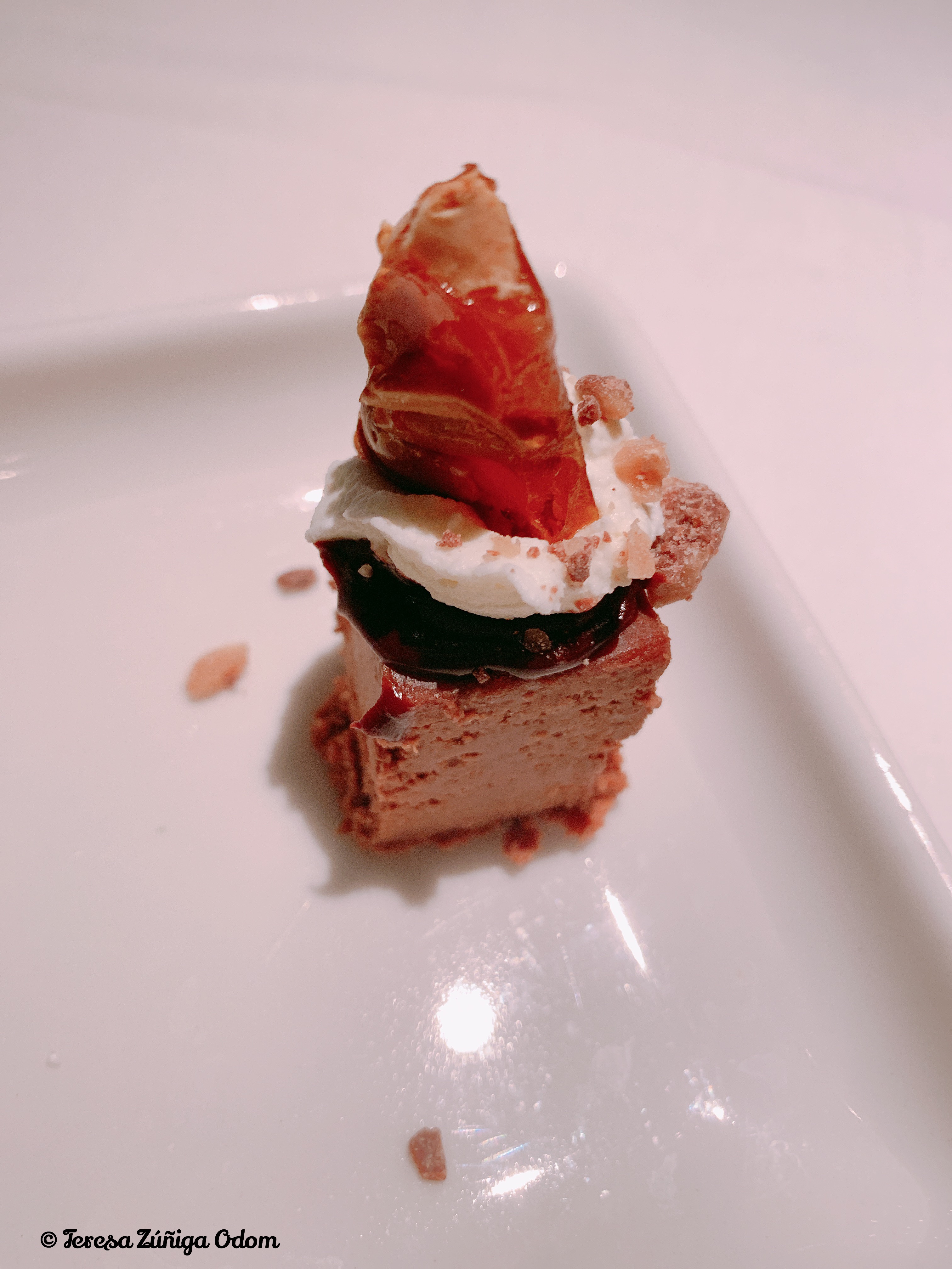
 Last Sunday, my husband and I arrived for and early supper at Perry’s. The April special is a three course meal consisting of your choice of salad, their legendary slow-roasted, caramelizad pork chop and finally, their decadent dessert trio. Let me just say this…make sure you go hungry!!! This combination is out of this world!
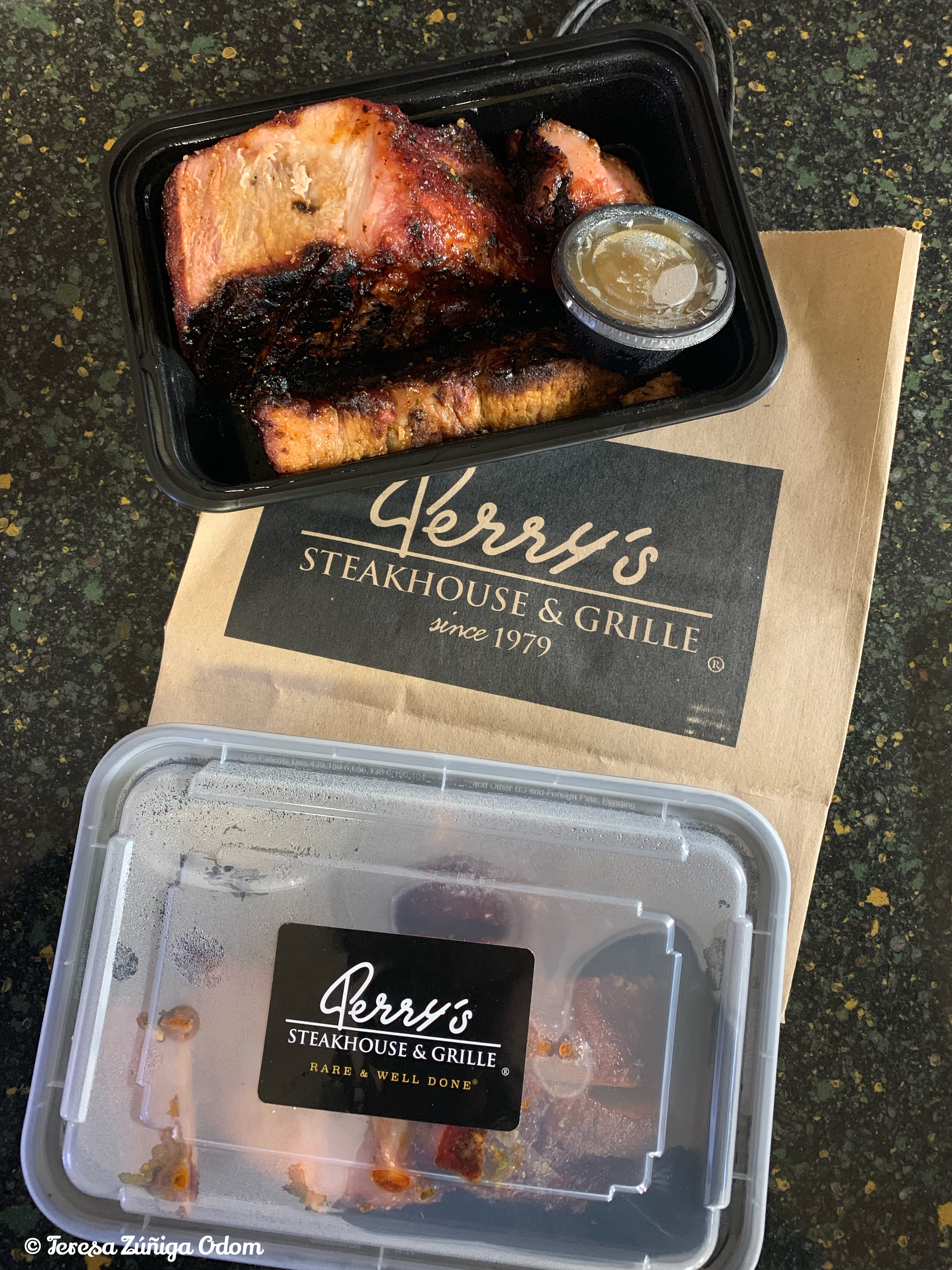
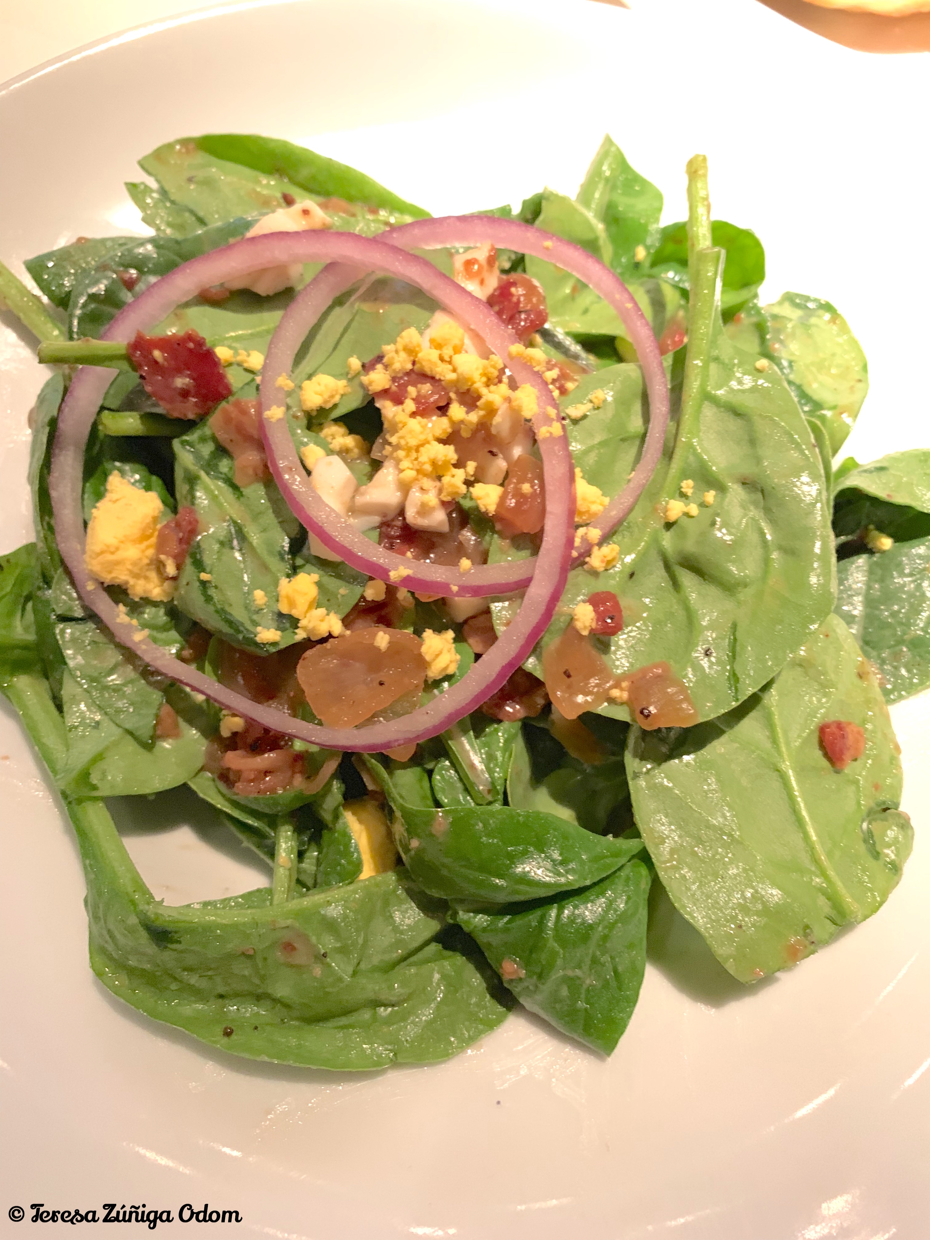 We started with salads, Eddie ordered the wedge salad while I had the warm spinach and bacon salad. We had just finished these when the pork chops were brought out on sizzling platters. The young man carving them explained what he was doing…first slicing the ribs, followed by what Perry’s calls the eyelash – a small portion of dark meat and then the loin along with a side of applesauce. He also suggested sampling everything in that order. Wow! That first warm bite was incredible! The caramel flavor along with spices and garlic butter was so rich I just wanted to savor it for a bit.


 After that first bite I reached for the Perry’s Reserve Pinot Noir to complete the pairing and it was heavenly! The Pinot Noir is out of Monterey County California and you can definitely get hints of berries and cherry aromas with a very smooth finish. It was created especially to pair with the pork chop and I can see why! I found myself alternating between bites and sips throughout the rest of my meal!


 It’s been a busy weekend…friends from out of town are here and we’ve made plans to spend time with them at Samford University’s homecoming weekend and later watch the Alabama football game.